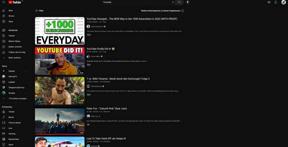
It carries out these tests with a random set of users, most of whom had no intention to be a part of this group in the first place. Since beta testing is usually an unfinished product with many unpolished and rough edges, users are more often than not left with a buggy version of YouTube. And the same has been the case this time around as well. Many users have voiced their concern that the YouTube search results are now left aligned on their accounts.
As a result of which, the UI looks quite unpleasant and appears to be rather broken, with the search results being pushed toward the left menu bar which ends up creating a large empty space on the right. If you are also part of this testing and wish to revert to the old styler wherein the search results were centrally aligned, then this guide shall help you out. Follow along for the fix.
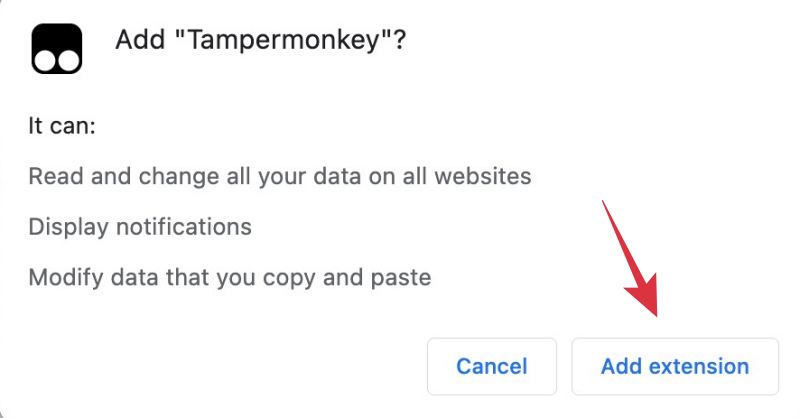
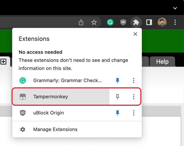
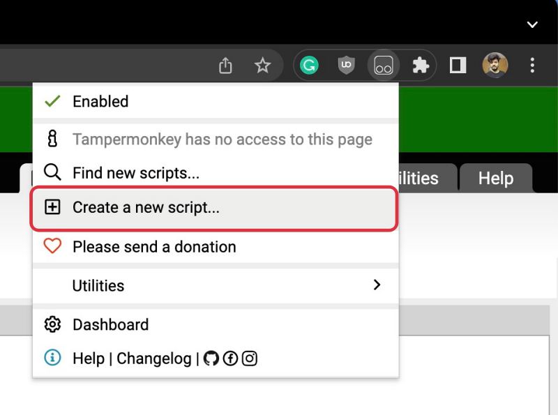
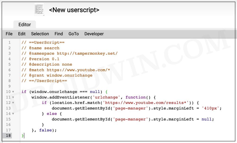
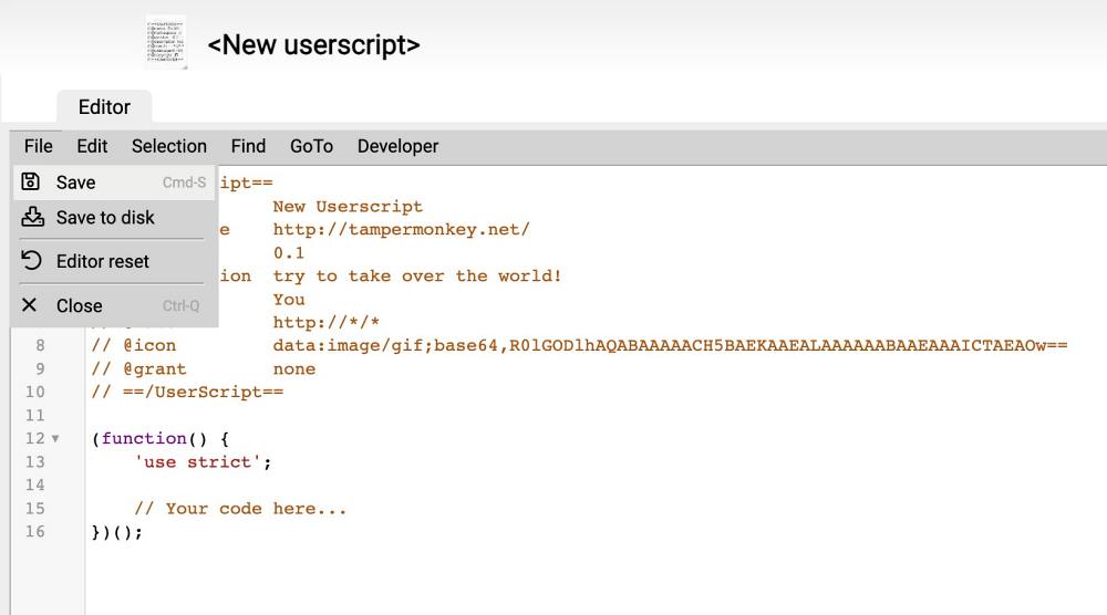
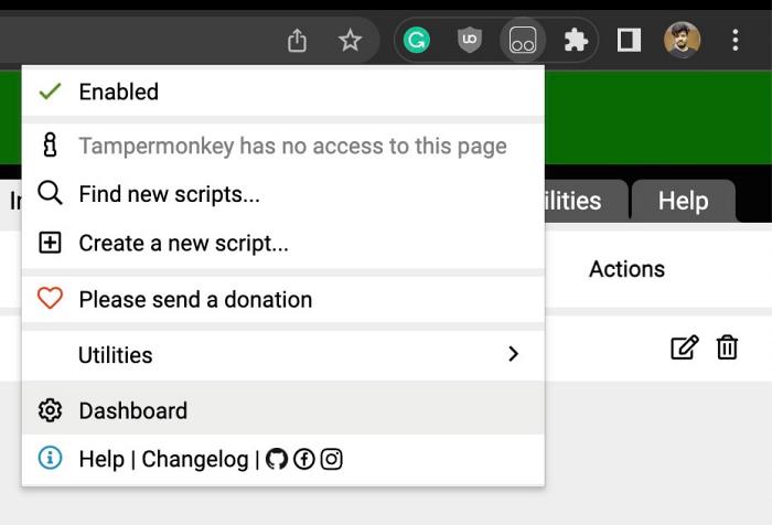
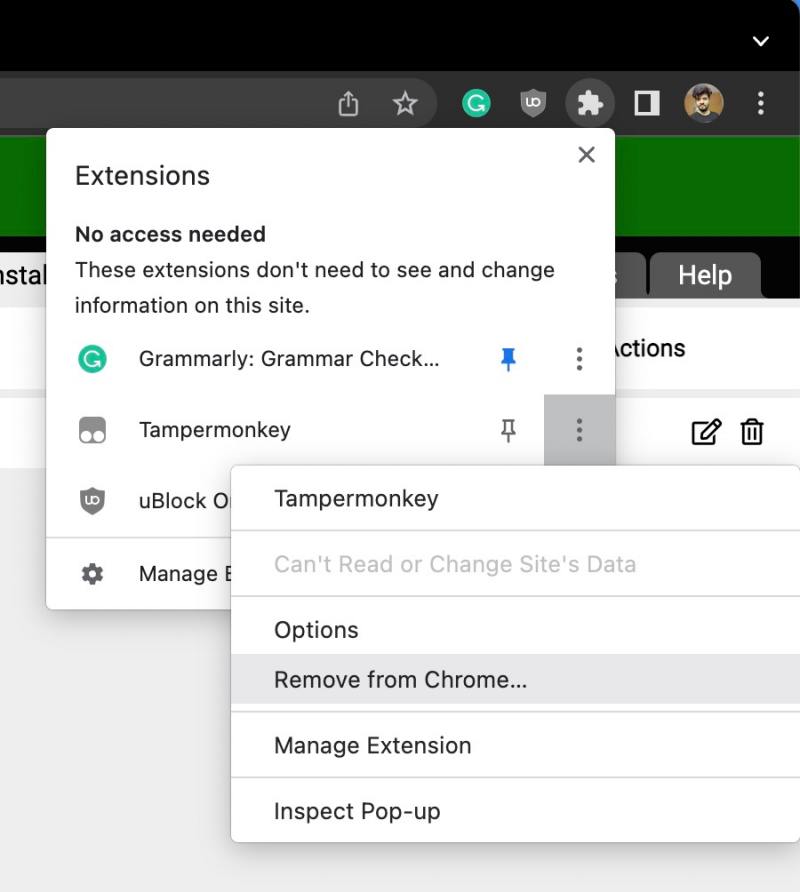
Fix YouTube Search Results Left Aligned
That’s it. These were the steps to fix the issue of YouTube search results being left aligned. As far as the official stance on this matter is concerned, the developers are aware of this issue, but they haven’t given out any ETA for the rollout of a fix. As and when that happens, we will update this guide accordingly. In the meantime, the aforementioned workaround is your best bet.
Google Home blocks offensive YouTube content [Fixed]YouTube Search Results Blank in Safari on Mac [Fix]YouTube black triangle in video thumbnail: How to FixHow to Disable Ambient Mode on YouTube
About Chief Editor

